
5 Common Webtoon Typesetting Mistakes
...and how to fix them.

1. Transformed text
It’s a surprisingly common mistake a lot of typesetters make when using Photoshop or Clip Studio. Resizing your text using boxes can lead to skewed text which can make your fonts look inconsistent... even if you only use one font.
The two examples of text above are the same font, but the one on the right has been resized by click-dragging on Clip Studio. It’s not a major issue if the ratio is locked, but unlock it and suddenly it looks like a completely different font.
For that reason, you should always be resizing using font sizes instead of dragging corners of text boxes.
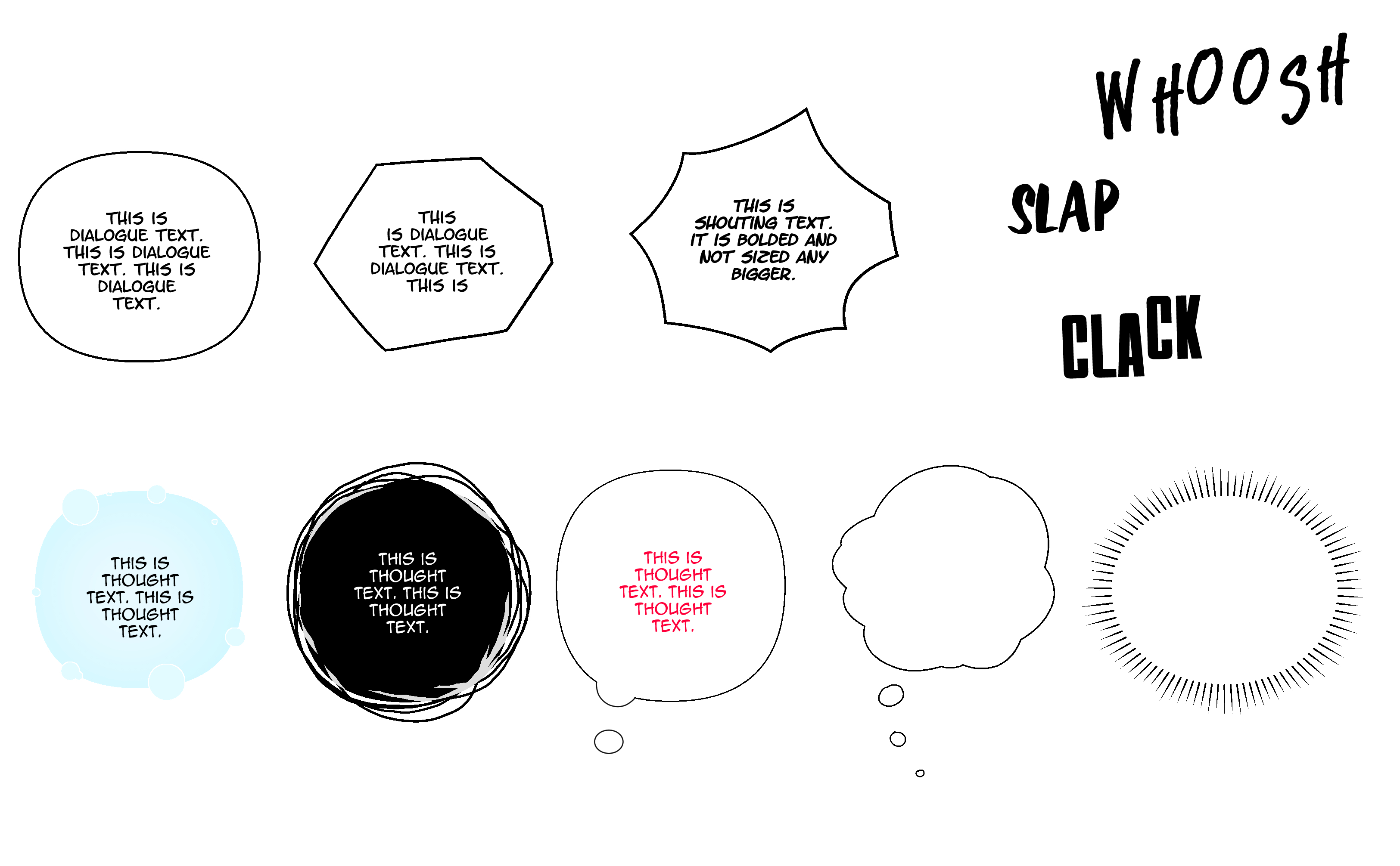
2. Using too few fonts
A lot of webtoons can do everything right, but fall apart on their font choices. Or, more specifically, using too few fonts when typesetting their story.
Make things easier on yourself and use a minimum of three fonts for your story: dialogue, narration, thought bubbles.
This makes it easier to differentiate the type of speech occurring and gives a bit of variation for readers of your story.
Webtoon Typesetting for Beginners: Setting Your Fonts (Free Ones)

This guide is written for anyone, but I wanted to make it beginner friendly. As such, all links for fonts are Blambot, specifically those available for free to indie creators. Feel free to use the fonts and share them with colleagues and friends, but please use the official site to download them.
3. Typesetting each episode from scratch
The biggest mistake amateur typesetters make is not using a scratch typesetting page. Or two or three.
These are basically “cheat sheets” that you can copy elements from instead of redrawing or re-setting your typesetting elements for each page.
Having scratch pages speeds up your workflow and leaves more time to add fluorishes or highlighting elements to your work.
4. Overly long dialogue in bubbles
One consequence of Korean webtoon typesetting habits bleeding into other languages are bubble sizes. Korean text is notoriously short which often means that translated text gets blown up in translation.
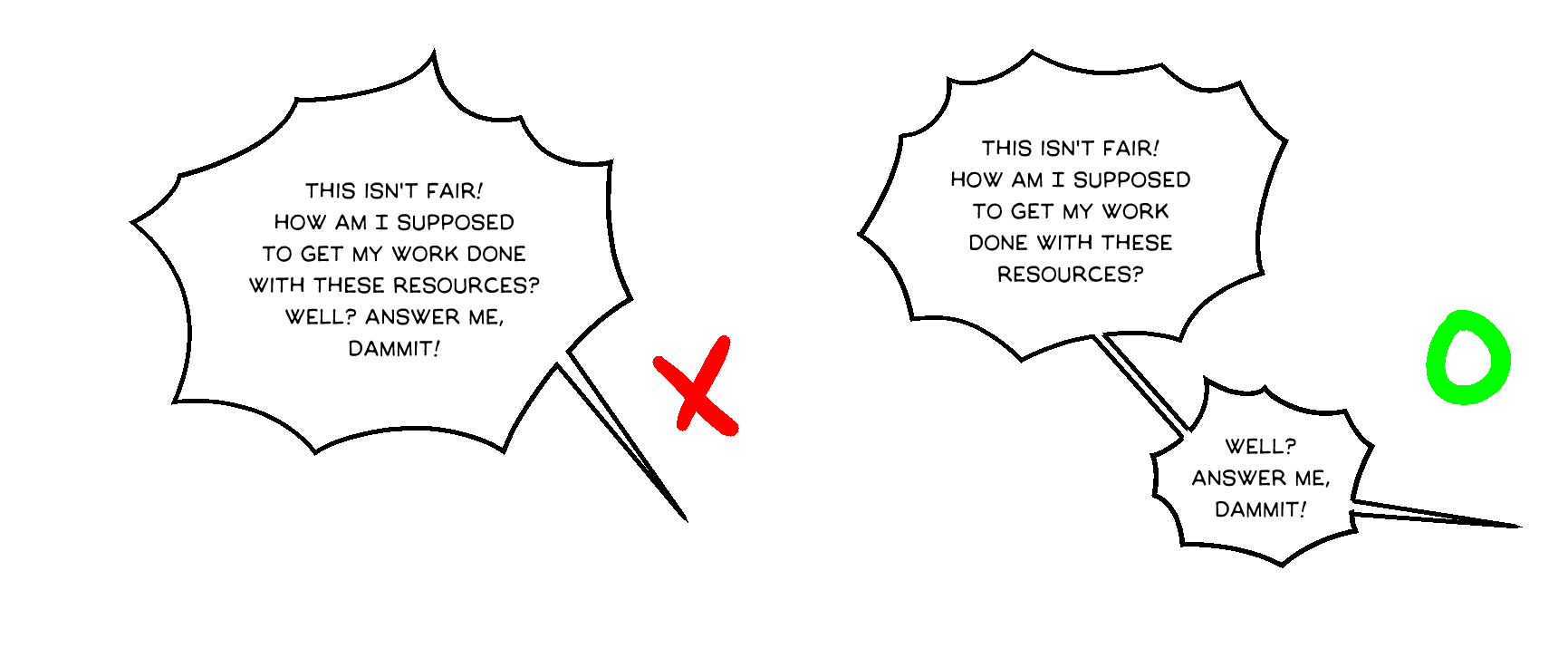
But for original webtoons, a lot of the same rule apply because while western comics tend to have longer dialogue text in their bubbles, webtoons prefer shorter “bites” of text.
And when text gets too long? Cut it up over several bubbles.
5. “To Be Continued”
This isn’t just typesetters, but webtoon creators in the general. And not just in the western world, but Asia as well. Because one of the hallmarks of webtoons isn’t at the beginning or the middle, it’s at the end.
Korean webtoons traditionally end with “To Be Continued” in English. In Korea, it was cribbed from western dramas and movies to remind readers that there were more episodes to come.
And that tradition should continue because it isn’t a given that every story will continue. More and more shorts are being translated or written, so if your story is wrapping up a huge plot point or seems like it’s coming to a close... but isn’t, then make sure to include this tag at the end.