
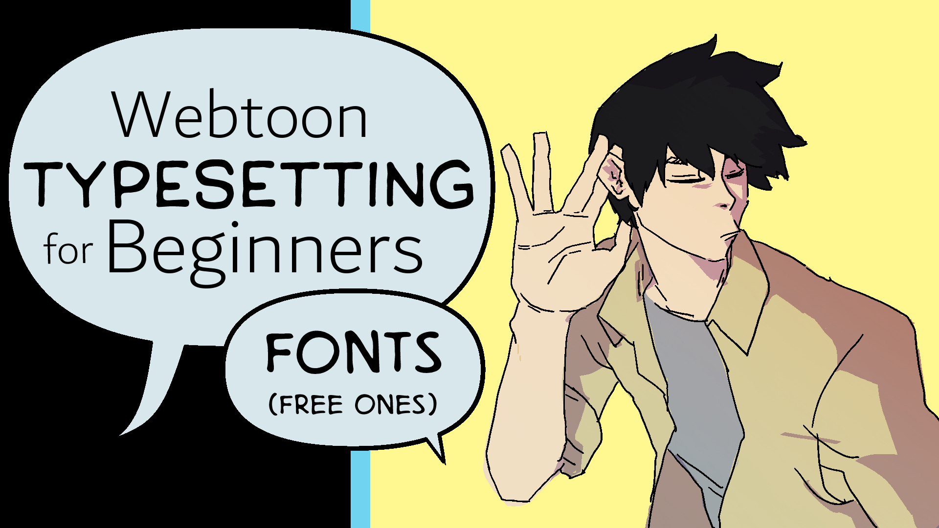
Webtoon Typesetting for Beginners: Setting Your Fonts (Free Ones)

This guide is written for anyone, but I wanted to make it beginner friendly. As such, all links for fonts are Blambot, specifically those available for free to indie creators. Feel free to use the fonts and share them with colleagues and friends, but please use the official site to download them.
One of the first major lessons I had when I started in the webtoon industry was in typesetting. I worked with Korean typesetters and even though they didn’t have a full-grasp of the English language, they were good enough at typesetting and design that they could work in multiple languages and end up with well-designed panels.
Typesetting for the webtoon medium is actually a lot easier than it seems. This is a byproduct of “digital first” production but also because most webtoons are typeset using fonts rather than “drawn” text.
This guide will focus on the basic task of introducing commonly used fonts for webtoons published in English (as well as French and Spanish if we’re being honest).
So, let’s get started.9
Setting Your Palette
There are different ways to approach the use and selection of fonts in a webtoon or digital comic, but generally there are four separate fonts used in each webtoon. You can go further, especially if you’re working on fantasy, action, or adult content as those will certainly require multiple variations of sound effects.
For now, we’ll cover the basic four-font typesetting structure of webtoons:
Dialogue
Narration
Soft SFX
Hard SFX
This case covers the vast majority of webtoons produced in Korea and abroad. Higher-productions might increase the number of sound effect fonts, but unless you’re working on large-scale sci-fi-action-fantasy titles, two is almost always enough.
When you’re picking your fonts, you want to prioritize readability above all else. Fancy text looks nice, but if your audience has a hard time reading or understanding the text, it’s time to move on.
Let’s take a look at some of my favorite fonts to use for typesetting webtoons.
Pick Your Letters
Dialogue and narration are the two most important fonts as you’ll be using. Not only because you’ll be using them the most, but because they need to fade into the panels as a part of the story telling. Unlike sound effects, they’re not meant to stand out nor are they meant to call undue attention to themselves.
That being said, they also need to match the type of storytelling and/or genre of story you’re telling.
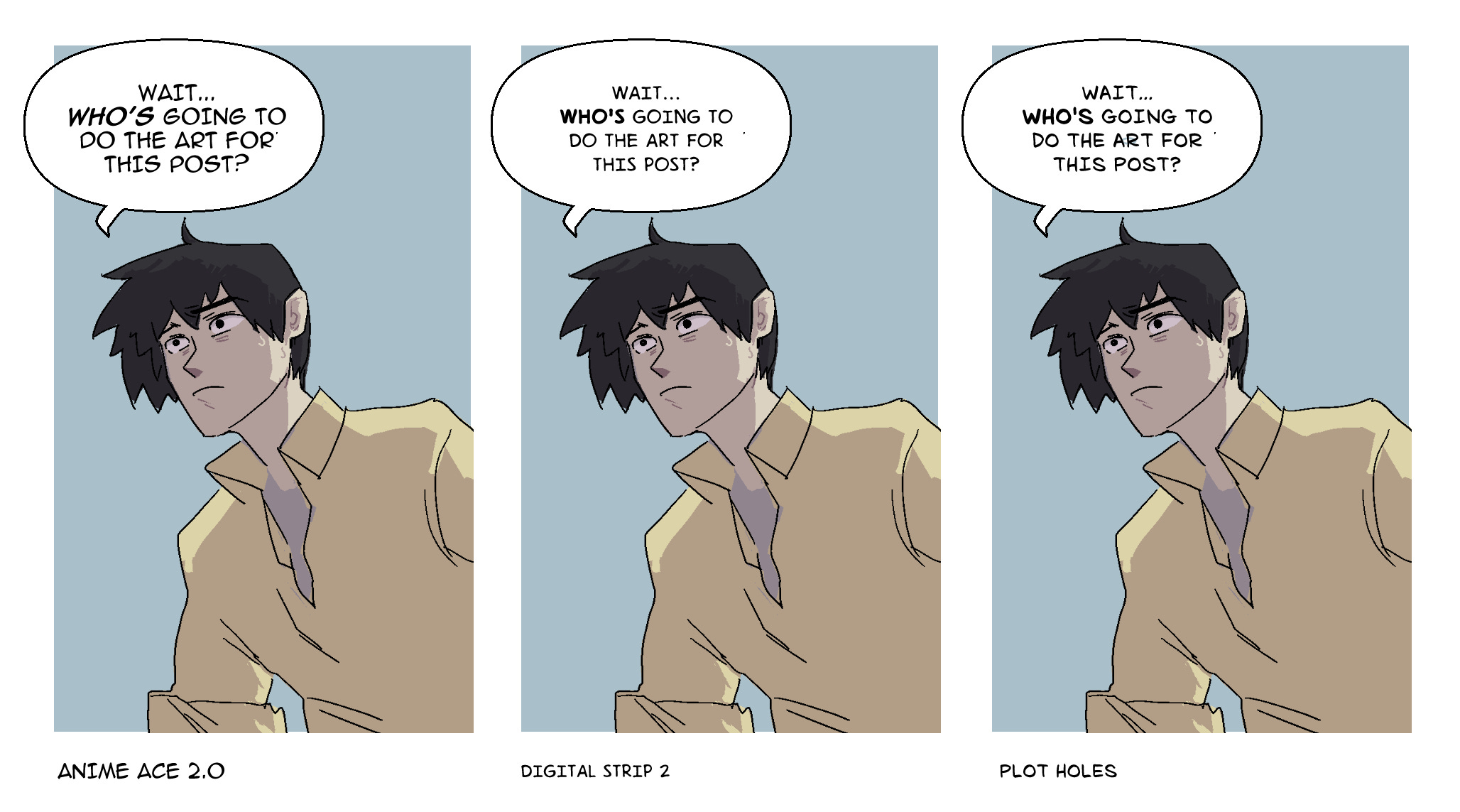
For most titles, Anime Ace 2, Digital Strip 2, and Plot Holes are my “go-to” dialogue fonts that are versatile enough to fit most genres easily. From there, I’d recommend Kid Cosmic or Webletterer for dramatic, more serious titles. And if you want to go into high-fantasy, Faded Frontiers looks quite amazing.
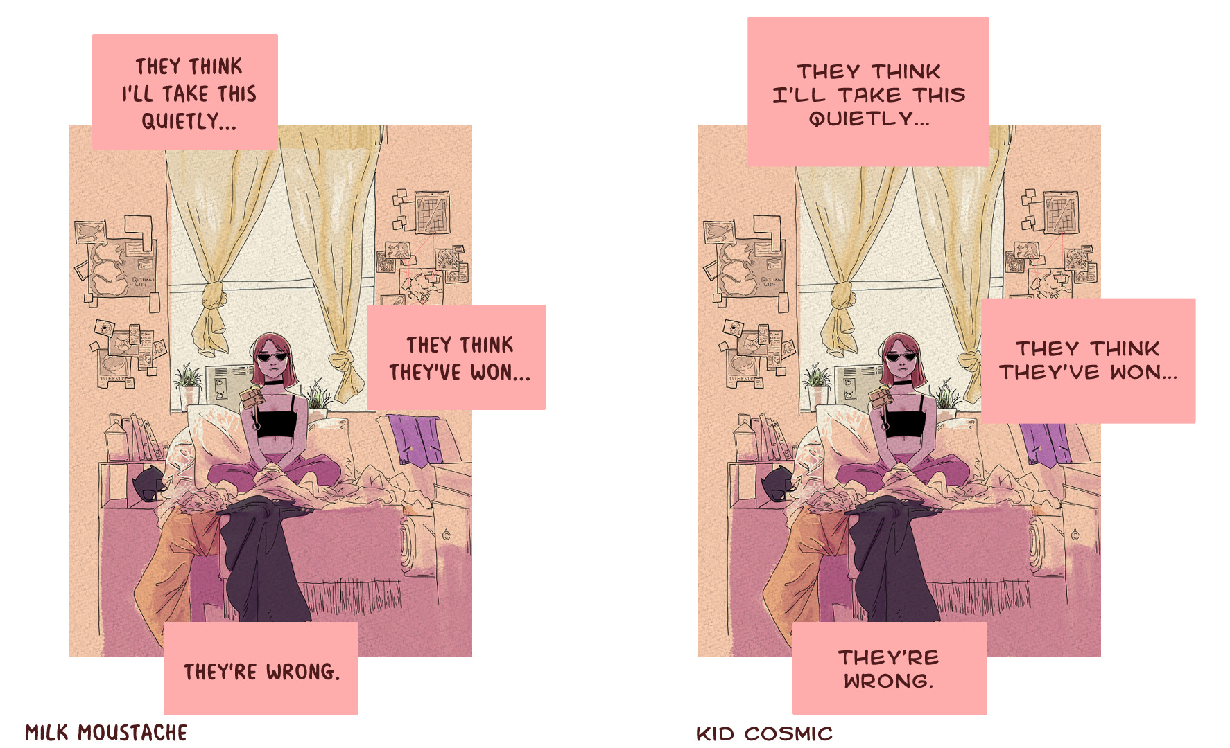
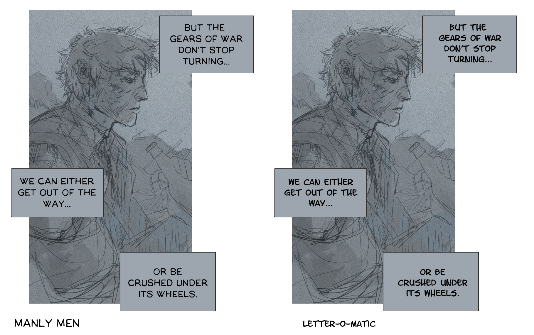
The narration font depends heavily on one factor: whether or not it is character narration. If there is a character narrating the story, I prefer using “softer” fonts like Milk Mustache or Kid Cosmic. If the narration is handled by an omniscient narrator, I generally like “harder” fonts like Manly Men or Letter-O-Matic.
There are, of course, a host of other fonts to use but these choices are incredibly common in webtoon publishing. That means they have the added benefit of feeling familiar to readers around the world.
The Art of Onomatopoeia
Sound effects are a special headache for most typesetters. Whether it’s placement, shaping, or coloring, good typesetting can add to the effect of a scene or (unintentionally) draw attention away from the scene altogether.
Sound effects in webtoons should meet two key criteria. They should:
draw attention to the action being performed
describe the degree of the action being performed
Unlike dialogue and narration fonts, sound effect fonts need to work with the art and visual aesthetics of the webtoon as a whole. And, for that reason, sound effect typesetting can be done near the end of a webtoon’s development cycle.
Soft vs. Hard Sound Effects
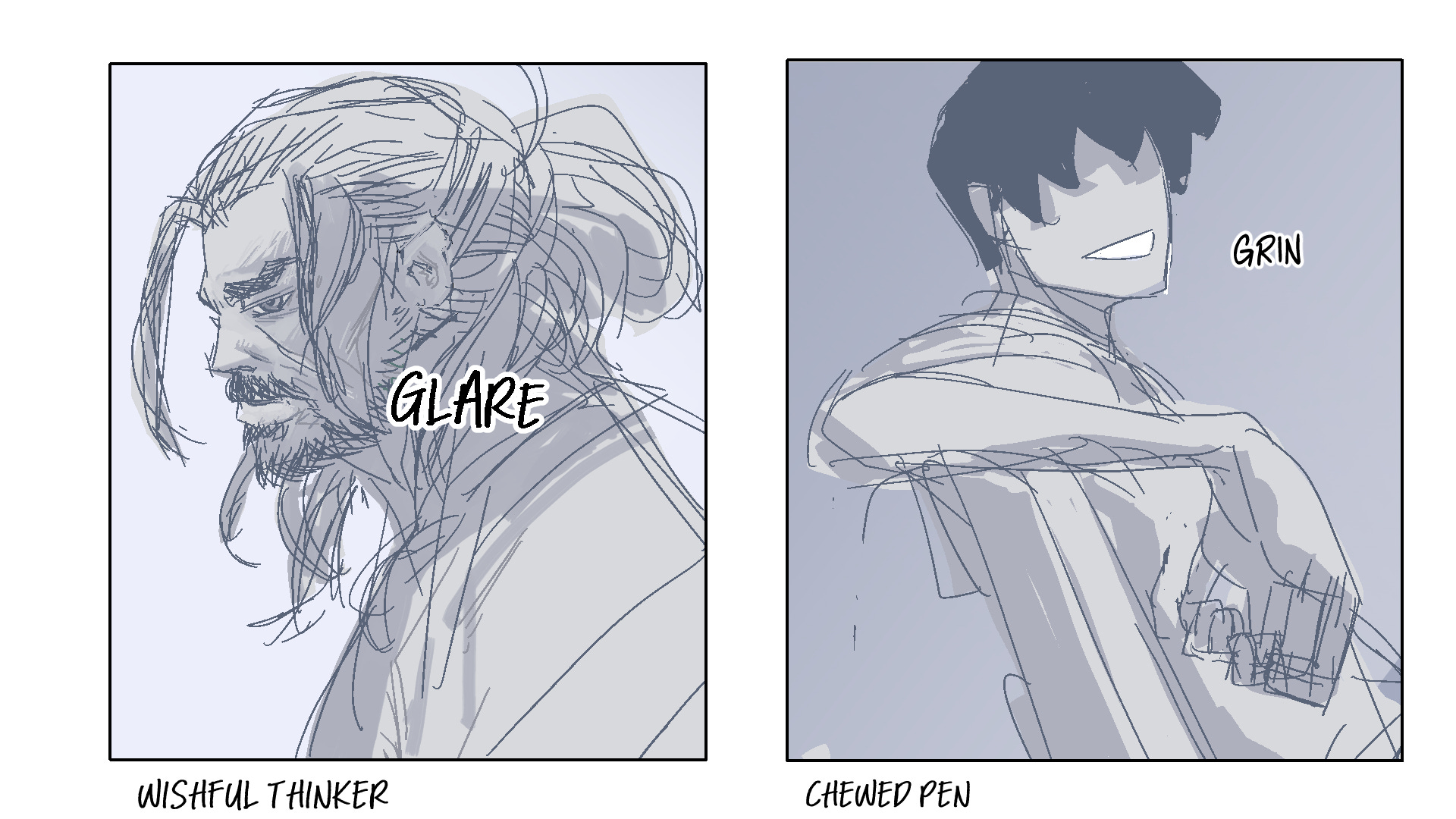
Korean webtoons are known for an overabundance of “soft sound effects”. Think of soft sound effects as causing very little or no actual sound. This is the “lean”, the “fwip” or the “stand”. You can often find these in Korean romance or romance fantasy webtoons in which case you might find multiple fonts just to change up the scenery. I’m a big fan of the “handwritten” look which is why I go for Wishful Thinker and Chewed Pen or similar fonts in that family.
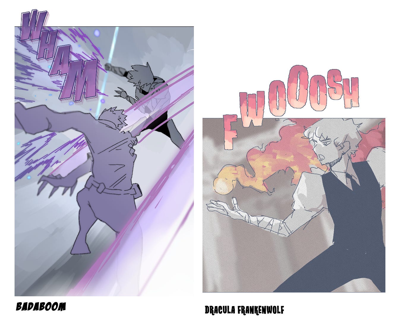
Hard sound effects are stronger actions like doors closing or fight sound effects. These fonts are meant to feel harsher and rougher (although that may depend on the genre.
Firepower and Damn Noisy Kids are two fonts I’ve started using more recently because of how much fun they are to look at. On the other hand, I have seen Crash Landing and Badaboom on literally every webtoon platform in existence.
And that’s it, folks.
You should have a nice palette of fonts to tell your story with and several options if you decide to change things up in the future.
I’ll be publishing the next section of this guide in the future covering more advanced techniques as well as the wide variety of bubbles you can find in webtoons to enclose the written word.
Until then, feel free to share this with friends and colleagues and leave comments if you have any questions or just want to share your thoughts^^